.jpg)
Making a KPI Dashboard in Tableau as a Portfolio Project
- kanelson711
- Oct 29, 2022
- 6 min read
It's been a while since I have had anything to say on here! Today I want to outline how I would go about creating a dashboard in Tableau- as if I was a relatively newer Tableau user.
First things first, I like to make a plan and an outline with any project I create. I ask myself:
- Who is going to be the target audience?
- What are they going to want to know?
- What are my important fields?
I will often begin by simply creating my wireframe in either a blank dashboard, or drawing on a sheet of paper. Sometimes if the data is unfamiliar to me I might create some sheets to explore what trends are there, but this time I am starting with my outline, since there are not many fields in the Superstore data.

Okay, time to get building! I want to show the previous month's performance. First up, let's create some KPI's. I am going to make my first KPI sheet, and arrange the formatting how I want it. This way, I can just duplicate it to make all of the following sheets, and that will save me time in skipping formatting each sheet.
Some important things I am doing to create this sheet:
I need to right click on the "Sales" field and find "Number Properties", so I can change the default to "Currency Custom" and show it to the closest dollar. This way it will format as a $ each time Sales shows up on my dashboard.
I am going to put a date filter on my data. For simplicity's sake, I am going to drag Order Date onto filters, choose "Relative Date", and set it to "Past Month".
I am going to pull Sales right into the center of the screen. Then, I am going to go to Text in the Marks Card to format it. I can add the text "Past Month Sales" right into the text box, after where the number is displayed.
I am making the number big and bold, and so it sticks out from the text below.
I am centering the alignment.
This will benefit me later, but I am going to go to formatting (Right click > Format) and turn the shading off on this sheet (Shading> Worksheet> None).

Ta-da! Now, onto the next KPI's. All I need to do is duplicate this sheet, and the formatting will come through on each of them. Once they are duplicated, I just need to change each of their names, the text in the text box, and switch out the measure. To switch out the measure, I just drag the new measure I want onto the Marks Card, and put it right on top of SUM(Sales).
I do need to make some additional changes in a few of these sheets:
Profit: I need to change the Profit field to also display as Currency, Custom.
Cost: I need to create this field. For simplicity, I created it as: [Sales]-[Profit]
Days to Ship: I also need to create this field! To do this I am using the DATEDIFF formula. This will tell me the difference in days, as an integer. Since I have Order Date and Ship Date in the data, I am able to see how long each order took to ship!
Here it is: DATEDIFF('day',[Order Date],[Ship Date])
I am also going to switch this field in the view from SUM to AVG- I want to know the Average time to ship, not cumulative time they all took to ship!

Okay, those are done! I also have this idea that it could be cool to make a Treemap to show how each Region compares in their Sales- and you could use this Treemap as a way to filter the entire dashboard to your selected region.
I am not going to worry about the colors right now, that will come later. To make this treemap I am going to put Region onto Color and Text, and SUM(Sales) onto Size. I am also going to reformat the Region labels, to look cleaner.

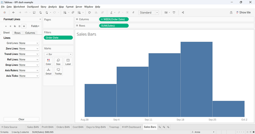
That's finished- now time for the final sheets- the Bar Charts with weekly performance.
First, I am going to filter my new sheet to the Order Date of "Relative Date" and "Past Month". Then I am going to right click on Order Date and put it on columns. When the popup window asks me which date format I want, I will choose Week Number. Finally, I am going to put Sales (sum) onto Rows.
For formatting, I am going to double click on the "Week of Order Date" axis, and in the window where the title is, I am going to delete the title, then close the window. Next, I am going to hide the header of the Sales all together, because this is intended to show a trend, more-so than the actual amount. This is a high level dashboard.
Finally, I am going to open up the formatting tab, and turn off all the lines.
Now I can duplicate this, and use it to create the Profit, and Orders bars. I needed to turn the left headers off again for each of these sheets.
Let's make a dashboard! I already know where everything goes, so it is just time to add them. To note- I am going to put all of the top KPI's in a Horizontal Container Together, as well as the bar graphs, and bottom line. It is easier to manage your spacing and sizing when things are in containers together.
I decided to hide the titles on every sheet, and change the Fit to Entire View (accessed via the dropdown carrot on the top right of the container).

Now, if you click on the Treemap, you'll see in the top right corner there is a filter icon. If you click it, then when you click a Region on the treemap, the rest of the dashboard will filter down accordingly. When you clear the selection, it will rever to all. Cool right?
Now it's time for some formatting. Here's what I am going to change:
The size of the dashboard
Edit the Title
COLORS! I am going to use the website Coolers to find a palate that I like. I am going to base the dashboard off of the following colors:
Blue/green: #3c6e71 - The background of the dashboard is this at 63%, and the containers are this color as well, at 100%
Dark Purple: #0e1c36 I am using this on the Bars.
Manilla: #e6d3a3 This is the base color for the treemap.
The Treemap I decided to put SUM(Sales) onto color, instead of region. I was less concerned with this showing intensity (since size already did this), but instead making the colors close to eachother, and visually appealing.

I decided that I wanted the top 3 KPI's and their associated Bar Charts to look like one continuous sheet, so I put the KPI and Bar sheet into a Vertical Container, and then put each of those Vertical Containers into a Horizontal Container. Then, I changed the color to the same as the background but at 100% for each of these three large containers, and each bottom sheet, and finally bumped all of their padding up to 15.

Finally, I am going to change the color on the sheets. I am going to make the bars a nice dark purple. I want the text on all of the sheets to be white- and here's a tip. If you right click on one of the BAN's on the dashboard, and open up the format tab, you can easily change the text color to white without leaving the dashboard. Then you can just click on each sheet with this Format tab still open, and change the Text to white.
Lastly, we cannot forget tooltips! I am going to turn off the tooltips for the KPI's, but on the bar charts I am going to center everything, delete the text before order date, and change the colors and boldness.

For the treemap, I am going to edit the tooltip to: Click on a Region to Filter the Dashboard. Clear the selection by clicking out of the boxes.
There we have it! This is a simple yet effective KPI dashboard, fit for any aspiring data analyst's portfolio. I hope you gave this a try on your own, and if you followed along, think of how you could customize this for yourself!
As a bonus, here is a screenshot and link to the KPI Dashboard that I made after I started my job, in order to practice some of the harder skills that I was learning:


Comments